A careers site that is not a job list.
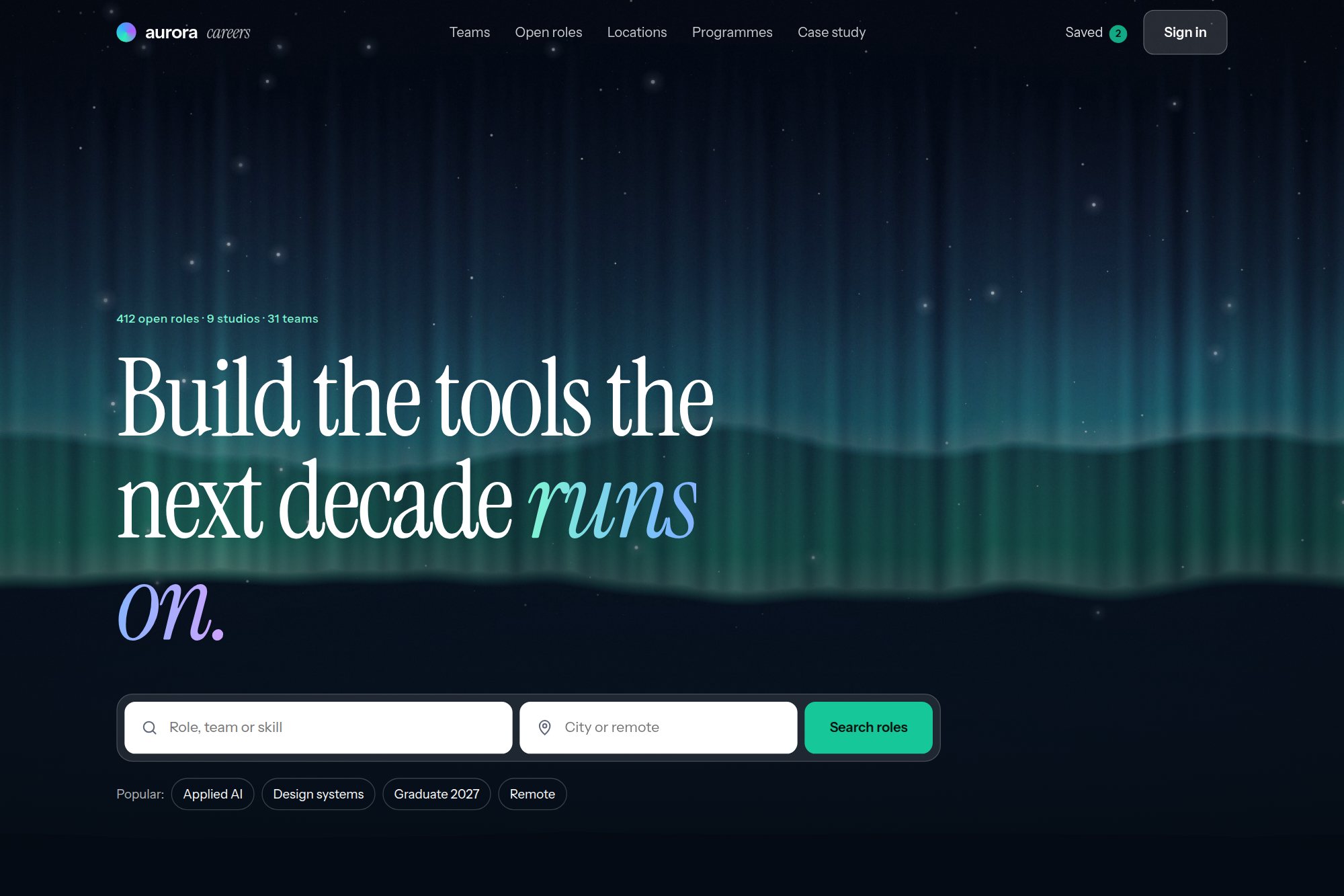
Teams, mission and location given equal standing beside role search, in one employer brand system.
The brief
Careers sites reduce to a filtered job list, and the employer story ends up as a footer link nobody follows.
The brief was to make teams, mission and location the reason someone applies, without demoting the search that candidates actually arrive for.
Design decisions
Search sits above the fold, but teams and launch programmes are given equal weight beside it.
Three discovery surfaces — teams, job categories, locations — replace a single filtered list.
Editorial cards carry the studio’s own tone, so brand and recruitment run on one system.
Outcome
A careers experience where role search and employer storytelling occupy the same page, with three discovery routes into the same set of roles.
A concept project designed in-house, not a client engagement. Figures describe the delivered design system — components, screens, scope and duration — not commercial results.
The concept is live and open to read.
The original build opens in a new tab, with its own case study page alongside it.
Start with the two-week diagnostic.
A 60-minute review, then a fixed-fee fortnight. You leave with a costed roadmap and no obligation to continue.
Auckland