Let the type do the heavy lifting
Illustration budgets shrink and stock photography all looks the same. Typography is the one brand asset that appears on every screen — and most design systems still treat it as an afterthought.
Take away the logo, the photography and the colour from most corporate websites and you would struggle to tell them apart. The type is a sans-serif at a sensible size, set in the default way, doing its job and nothing more. That is a missed opportunity, because typography is the one part of a visual identity that appears on every single screen a customer sees.
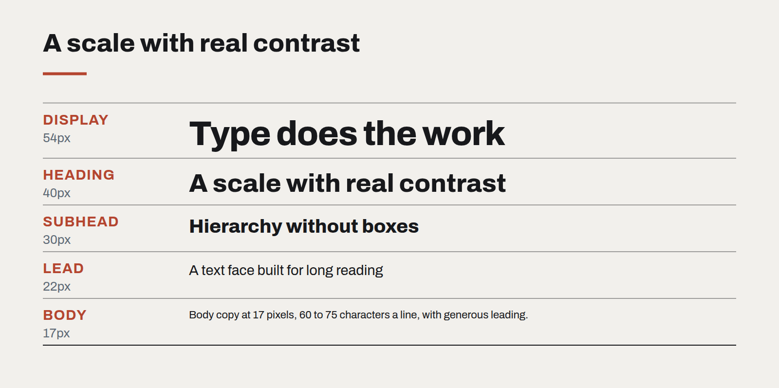
A growing share of the brand work we do now leads with type. Not decorative lettering, but a considered typographic system: one or two families chosen for character, a scale with real contrast, and rules for how headings, body and data behave. When that system is strong, photography becomes optional and illustration becomes a choice rather than a crutch.
Why type carries more weight now
Three shifts have pushed typography up the list.
- Stock imagery has lost its signal. Generated images and the same few stock libraries mean pictures no longer distinguish one brand from another. Readers skim past them.
- Interfaces are denser. Dashboards, tables and long documents are mostly text. The quality of that text is the quality of the product.
- Variable fonts matured. A single font file can now cover a wide range of weights and widths efficiently, so a rich typographic system no longer costs page speed.
What a typographic system needs
- A display face with character. Used for headings and key numbers, where it can be large enough to be noticed. This is where personality lives.
- A text face built for reading. Comfortable at 15–18 pixels, with clear figures and good support for the languages you publish in. For bilingual English and Chinese sites, test the pairing early; weights and vertical rhythm differ more than people expect.
- A scale with contrast. Many systems use sizes too close together, so hierarchy has to be rescued with colour and boxes. A ratio around 1.25 to 1.33 between steps usually gives headings real authority.
- Line length and leading as rules. Around 60 to 75 characters for body text, with generous line height. These two settings do more for readability than any font choice.
- Tabular figures for data. Numbers that line up in columns make tables and financial figures readable at a glance.
Type as the brand
On our own site we made a deliberate choice: no stock photography in the case library and a strong heading face carrying most of the identity. The effect is that a single headline, set well, communicates more about the studio than a hero image would.
Clients sometimes worry that type-led design will feel plain. It rarely does, provided the contrast is real. A heading at three times the body size in a face with some personality has as much presence as any photograph — and it will still look right when the next piece of content arrives with no budget for imagery at all.
Where to start
Audit the typography you have: how many families, how many sizes actually in use, whether they follow any scale. Most organisations find a dozen sizes where five would do. Collapse them, pick one face with character for display, and write the rules down. It is the cheapest brand upgrade available.
Designing interfaces for answers that might be wrong
Traditional software is either right or broken. AI features are usually right, sometimes wrong, and always confident-sounding. The interface has to carry the uncertainty the model won't.
A design system for teams without a design team
Most organisations that need consistency cannot justify a dedicated design-system group. A small, opinionated kit — and the discipline to keep it small — gets them most of the way.
Motion with a job to do
Animation is either explaining something or getting in the way. A short guide to the motion that earns its milliseconds, and the kind that should be cut.