A streaming homepage that serves discovery and sign-up.
A cinematic entertainment hub concept where browsing depth and a single sign-up route stop competing.
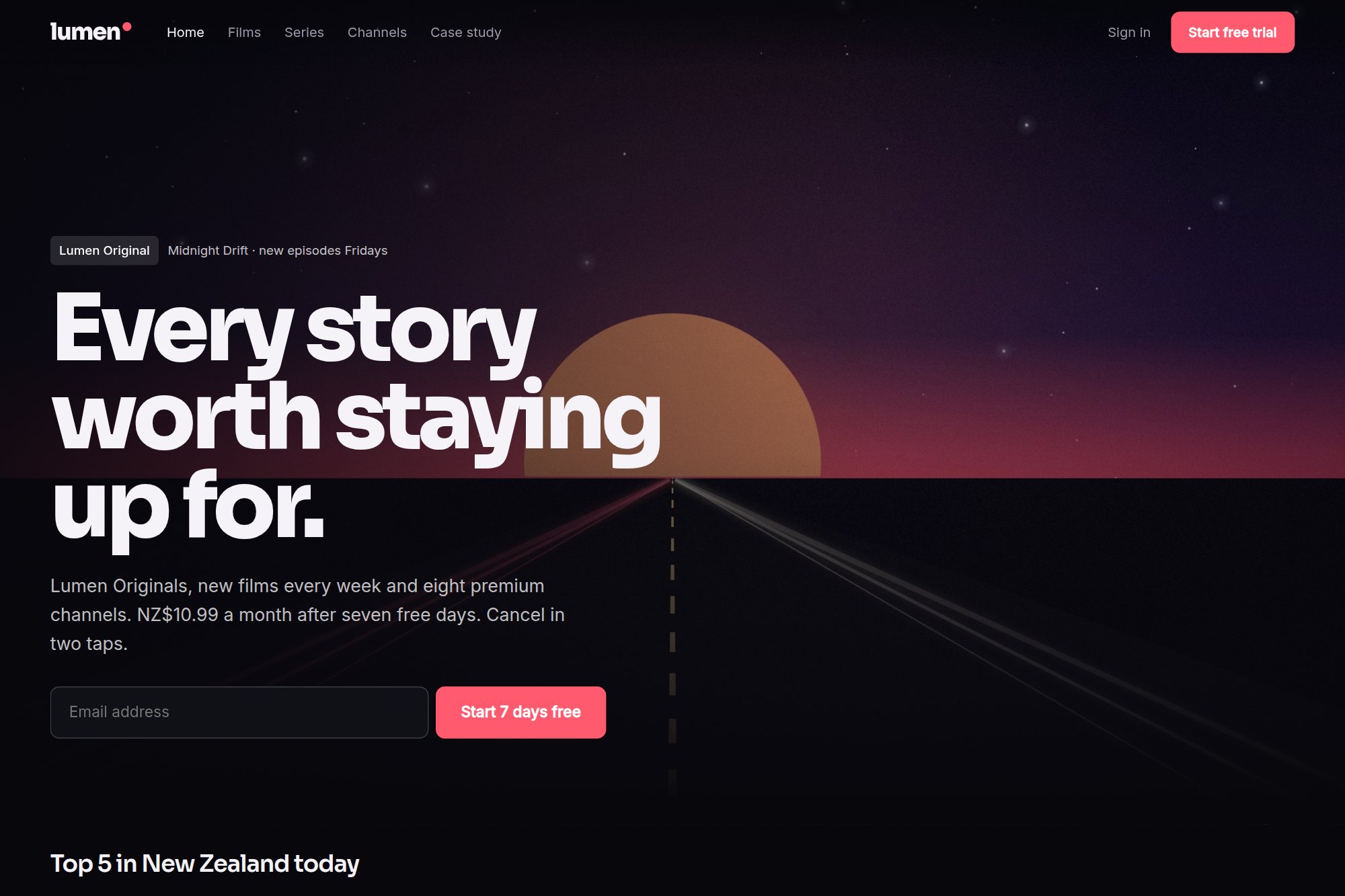
The brief
Streaming homepages have to serve content discovery and sign-up at once, and the two normally compete for the same region of the screen.
The concept blends premium discovery with a focused sign-up path, so neither is buried by the other.
Design decisions
A single bold hero statement with one action, placed ahead of the content wall.
A poster grid sized for browsing depth rather than editorial promotion slots.
Motion tokens and a content grid delivered alongside the UI system, so the wall stays consistent as the catalogue grows.
Outcome
A cinematic homepage concept delivered in six weeks as a UI system, motion tokens and content grid, with the sign-up path kept to a single route.
A concept project designed in-house, not a client engagement. Figures describe the delivered design system — components, screens, scope and duration — not commercial results.
The concept is live and open to read.
The original build opens in a new tab, with its own case study page alongside it.
Start with the two-week diagnostic.
A 60-minute review, then a fixed-fee fortnight. You leave with a costed roadmap and no obligation to continue.
Auckland