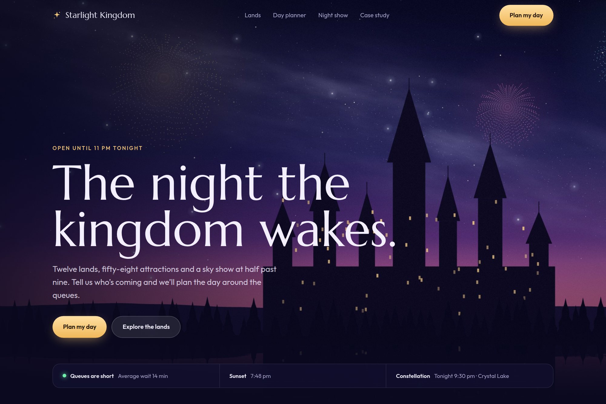
A destination page that also plans the day.
A cinematic landing concept and a queue-aware itinerary planner sharing one visual system.
The brief
Destination sites sell the visit and then leave the planning to the visitor, usually in a separate app with a different design language.
The concept had to do both jobs in one place, and make the itinerary — not the brochure — the page’s primary output.
Design decisions
Three planner modes — explorer, family and night spectacle — instead of one generic itinerary builder.
Routes optimised against queue times, with live show reminders treated as part of the plan.
The cinematic landing and the planning workspace share one visual system, so the handoff never feels like a different product.
Outcome
A landing page and a planning workspace that read as one product, with itinerary output as the page’s primary conversion instead of a generic ticket link.
A concept project designed in-house, not a client engagement. Figures describe the delivered design system — components, screens, scope and duration — not commercial results.
The concept is live and open to read.
The original build opens in a new tab, with its own case study page alongside it.
Start with the two-week diagnostic.
A 60-minute review, then a fixed-fee fortnight. You leave with a costed roadmap and no obligation to continue.
Auckland