Designing interfaces for answers that might be wrong
Traditional software is either right or broken. AI features are usually right, sometimes wrong, and always confident-sounding. The interface has to carry the uncertainty the model won't.
For most of the history of software, interface design could assume that the system was correct. A calculator shows the total; a booking system shows the booking. If the answer was wrong, that was a bug, and bugs were fixed. Users learned to trust what the screen said.
AI features break that assumption. A summary can leave out the one sentence that mattered. An extracted invoice total can be read from the wrong line. A suggested reply can be fluent, polite and factually wrong. The model delivers all of these in the same confident tone as its correct answers, so the interface is the only place left where uncertainty can be made visible.
This is now one of the most important design problems in business software, and most products are still handling it badly — either hiding the uncertainty entirely or smothering every answer in disclaimers nobody reads.
Show the source, not a warning
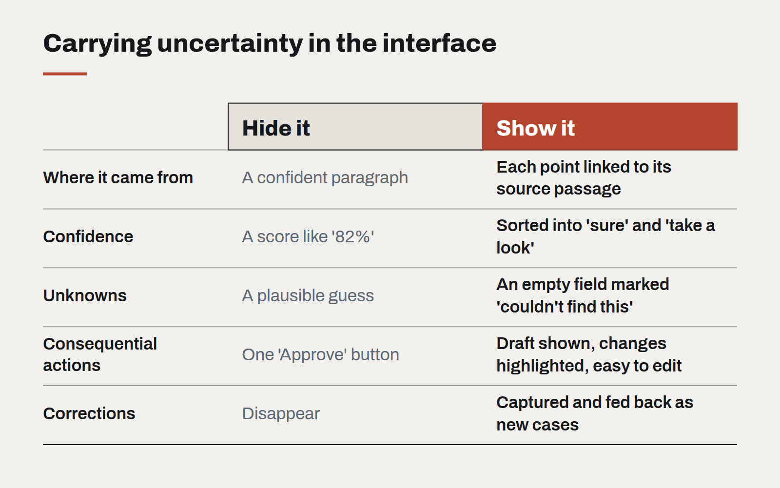
The most effective single pattern is to show where an answer came from. A summary with each point linked to the passage it was drawn from. An extracted amount highlighted on the original document. A recommendation with the three records that support it.
Sources do what disclaimers cannot. They let users check quickly, at the moment of doubt, without leaving the flow. And they calibrate trust naturally: after a few checks that confirm the answer, users rely on it more; after one that doesn't, they know to look.
Make review the default for consequential actions
Where an AI output will trigger something that matters — sending an email, approving a payment, updating a customer record — design the flow around review rather than confirmation. Show the draft, highlight what was generated or changed, and make editing as easy as accepting. A single "Approve" button with the output hidden behind a fold invites rubber-stamping.
Express confidence in the user's terms
Numeric confidence scores are rarely helpful; "82%" means little to most people and invites false precision. Better approaches:
- Sort by confidence instead of labelling it: items the system is sure about in one group, items that need a look in another.
- Mark specific fields, not whole results: the date was read clearly, the amount was ambiguous.
- Let the system say it doesn't know. An empty field marked "couldn't find this" is far more useful than a plausible guess.
Make correction feed back
When a user corrects an AI output, capture it. The correction improves the next answer, becomes an evaluation case, and — shown back to the user later — builds confidence that the system learns. An interface where fixing a mistake disappears into nothing teaches users that fixing mistakes is pointless.
Keep the AI visually honest
Mark AI-generated content consistently, in a quiet way, so users always know what was written by a person and what was not. Avoid the sparkle-and-gradient styling that presents AI output as special. It should look like any other content — just clearly labelled, and always one click from its source.
A design system for teams without a design team
Most organisations that need consistency cannot justify a dedicated design-system group. A small, opinionated kit — and the discipline to keep it small — gets them most of the way.
Motion with a job to do
Animation is either explaining something or getting in the way. A short guide to the motion that earns its milliseconds, and the kind that should be cut.
Let the type do the heavy lifting
Illustration budgets shrink and stock photography all looks the same. Typography is the one brand asset that appears on every screen — and most design systems still treat it as an afterthought.